Visual Utilites
Display
Inline Block
.fizz-inline-block applies the inline-block value, making an element work like an inline
element while respecting top/bottom margins and padding.
Hidden
Use these utilities to change the display property of an element to hidden, removing it from the flow of the document, either on small screens (less than 700px), large screens (greater than 700px) or both.
| Utility Class | Description |
|---|---|
.fizz-hidden |
Hides an element |
.fizz-hide-on-small |
Hides an element when the viewport is < 700px |
.fizz-hide-on-large |
Hides an element when the viewport is > 700px |
Borders
Use .fizz-bordered to apply a border and radius to an element. Or you can use
.fizz-bordered-squared to add borders without rounding the corners.
This has a border and rounded corners.
This has a border only.
HTML
<div class="fizz-bordered fizz-inset-square-16">
  <p>This has a border and rounded corners.</p>
</div>

<div class="fizz-bordered-squared fizz-inset-square-16">
  <p>This has a border only.</p>
</div>
Hover state
Sometimes you may want the border to have an active-border on hover. Use the .fizz-bordered--hover class
with the .fizz-bordered class.
This border has a hover state.
HTML
<div class="fizz-bordered fizz-bordered--hover">
  <p>This border has a hover state.</p>
</div>
You can also apply just a border to one side of an element.
This has a top border.
This has a left border.
This has a right border.
This has a bottom border.
HTML
<div class="fizz-border-top fizz-inset-square-16"
     style="width: 320px;">
  <p>This has a top border.</p>
</div>

<div class="fizz-border-left fizz-inset-square-16"
     style="width: 320px;">
  <p>This has a left border.</p>
</div>

<div class="fizz-border-right fizz-inset-square-16"
     style="width: 320px;">
  <p>This has a right border.</p>
</div>

<div class="fizz-border-bottom fizz-inset-square-16"
     style="width: 320px;">
  <p>This has a bottom border.</p>
</div>
Outline Active
Apply .fizz-outline-active to highlight an element. This uses outline rather than
border to prevent increasing the size of the element's box model. The outline will take on the shape of
the element's border radius.
This element has an active outline
This element has an active outline + .fizz-bordered
HTML
<div class="fizz-inset-square-16 fizz-outline-active">
  <p>This element has an active outline</p>
</div>

<div class="fizz-bordered fizz-inset-square-16 fizz-outline-active">
  <p>This element has an active outline + <code>.fizz-bordered</code></p>
</div>
Border Radius
The default radius is 4px ($radius-medium). You can apply utility classes to adjust this radius in
certain circumstances. Use .fizz-radius-none and .fizz-radius-medium sparingly, when needing
to override elements with existing border radius applied.
.fizz-radius-none
This has no border radius.
.fizz-radius-small
This has a 2px border radius.
.fizz-radius-medium
This has a 4px border radius.
.fizz-radius-large
This has a 8px border radius.
.fizz-radius-xlarge
This has a 16px border radius.
.fizz-radius-round
This has a 50% border radius.
HTML
<div class="fizz-bordered fizz-radius-none fizz-inset-square-16"
     style="width: 320px;">
  <p>This has no border radius.</p>
</div>

<div class="fizz-bordered fizz-radius-small fizz-inset-square-16"
     style="width: 320px;">
  <p>This has a 2px border radius.</p>
</div>

<div class="fizz-bordered fizz-radius-medium fizz-inset-square-16"
     style="width: 320px;">
  <p>This has a 4px border radius.</p>
</div>

<div class="fizz-bordered fizz-radius-large fizz-inset-square-16"
     style="width: 320px;">
  <p>This has a 8px border radius.</p>
</div>

<div class="fizz-bordered fizz-radius-xlarge fizz-inset-square-16"
     style="width: 320px;">
  <p>This has a 16px border radius.</p>
</div>

<div class="fizz-bordered fizz-radius-round fizz-inset-square-16"
     style="width: 320px; aspect-ratio: 1; display: grid; place-items: center;">
  <p>This has a 50% border radius.</p>
</div>
Centering Content
Use .fizz-margin-auto to set the left and right margins of a block element to auto,
effectively centering it.
HTML
<button class="fizz-button-primary fizz-margin-auto">This is centered</button>Shadows
Use .fizz-elevation-1 to apply a shadow to an element.
This has a box shadow.
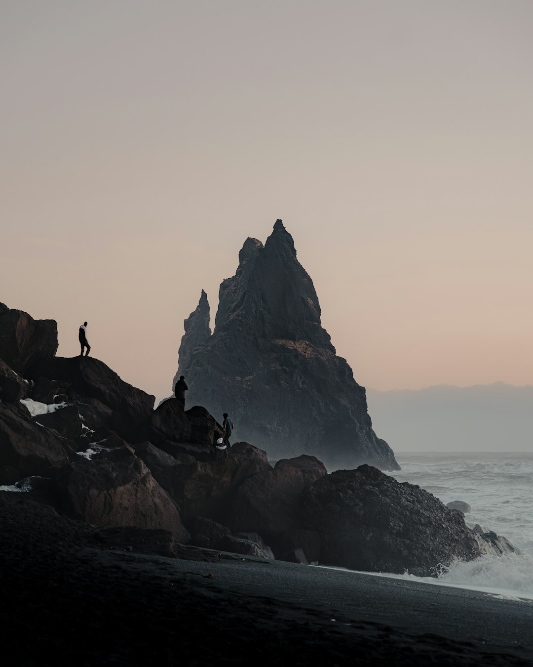
Images
By default, if the aspect-ratio of an image src doesn't match the size of it's container, it will be
distorted to fit that aspect ratio.
HTML
<img src="https://source.unsplash.com/random/300×300"
     style="aspect-ratio: 16/9"
     class="fizz-bordered"
     width="300">
There are a couple of utilities you can apply to change this behavior.
Contain
Use .fizz-contain to set object-fit: contain on an image, maintaining the image's aspect
ratio while fitting inside its container.
HTML
<img src="https://source.unsplash.com/random/300×300"
     style="aspect-ratio: 16/9"
     class="fizz-contain fizz-bordered"
     width="300">
Cover
Use .fizz-cover to set object-fit: cover on an image, maintaining the image's aspect ratio
while filling the container to fit the image.
HTML
<img src="https://source.unsplash.com/random/300×300"
     style="aspect-ratio: 16/9"
     class="fizz-cover fizz-bordered"
     width="300">